Diabeatit
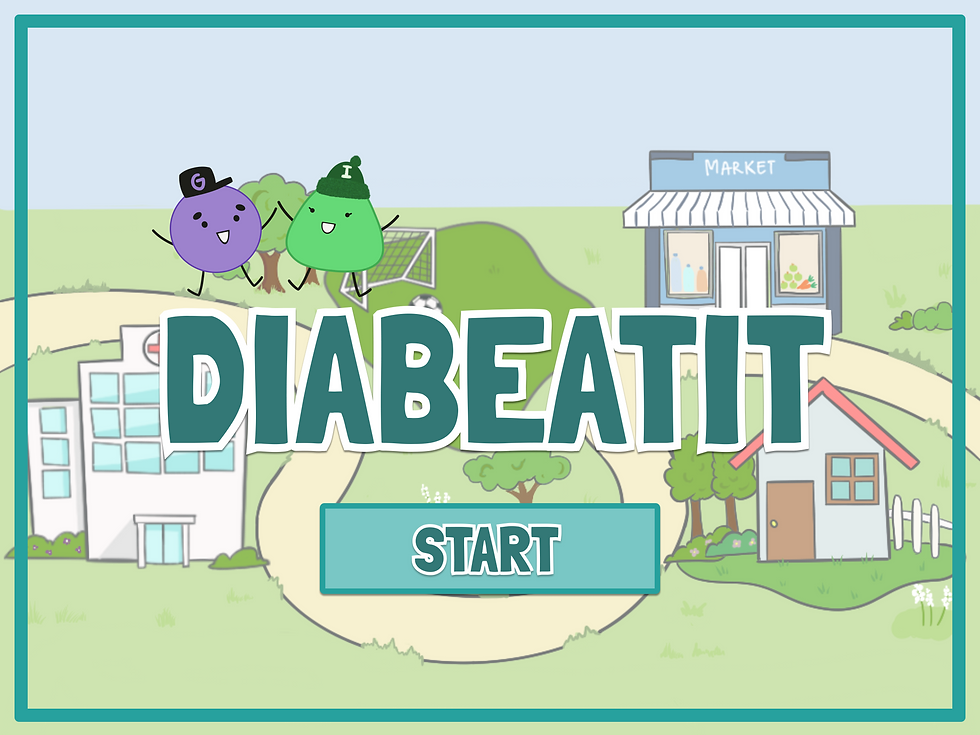
An educational app designed to help children ages 8–13 learn about Type 2 diabetes and build healthier daily routines through interactive storytelling and play.
UX Design
UX Research
Apr – Jun 2023
My contributions:
Research – User testing & feedback analysis
Design – Home storyline & interaction design
Synthesis – Research findings & design changes

Community Partner:
Charles G. Goldberg, MD
Team:
Yi Lu | UX Design Lead
U Lam Lou | UX Researcher
Kevin Lin | UX Researcher
Eejen Wu | Visual Designer
Natania Chen | Game Developer
Xiaofan Mu | Web/Game Developer
Diabeatit was developed through UC San Diego's Global TIES program in partnership with Charles G. Goldberg, MD. When our team joined the project, an existing educational game was already in development, with storylines, quizzes, and interactive elements for teaching children about Type 2 diabetes.
Rather than starting from scratch, we focused on improving the existing experience. One challenge stood out:
How could we make learning about diabetes easier to understand and more engaging for children?
This shaped both our exploration of more interactive learning and how we later evaluated the experience with users.
We started by playing through the existing game and reviewing its Figma prototype. Much of the educational experience relied on text, dialogue, and quizzes. While these storylines contained useful information, we questioned whether children ages 8–13 would be able to absorb that amount of diabetes-related information while remaining engaged.


We also noticed that much of the existing content focused on healthy eating, while fewer scenes explored the role of physical activity. Because the Home storyline was not yet fully developed, we used it to try a more interactive approach:
What if children could learn about healthy behavior by doing something instead of only reading about it?
We designed the Home storyline around a short basketball mini-game that introduced the role of exercise through participation rather than only text and dialogue.
01 Learn
The storyline introduces how exercise can help support healthy blood glucose levels and provides examples of physical activities.
02 Play
The player participates in a three-minute basketball mini-game.
03 Reward
After completing the activity, the player receives a badge to mark their progress.


With the updated experience in place, we wanted to understand how users interpreted the content, where they became confused, and what could be improved. We developed an interview protocol with three stages:
Pre-task
We asked participants about their academic background and existing knowledge of Type 2 diabetes to understand the context behind their responses.
Interaction
Participants explored the Figma prototype and completed tasks within the experience.
Post-task
We asked participants about their experience, including what they understood, where they encountered confusion, and what they thought could be improved.
Our intended users were children ages 8–13. However, within the 10-week project timeline, recruiting and scheduling sessions with children required additional time, coordination, and IRB considerations that we weren't able to complete during the quarter.
Game bugs also limited our ability to test the implemented experience. As a result, we conducted 10 user interviews with UC San Diego participants ages 18–24 using the Figma prototype.
10 Participants
Ages 18–24
Figma Prototype
Because our participants were not the intended users of Diabeatit, their feedback could help us identify potential usability and comprehension issues, but it could not tell us how children ages 8–13 would actually experience the game.
We therefore treated these findings as directional feedback for future iterations, rather than validation of the experience for our target audience.
Testing revealed several patterns in how participants responded to the experience.
4 / 10
participants found the roles of some cartoon characters unclear.
One participant explained:
“I thought glucose was a grape at first.”

5 / 10
participants thought children might have difficulty following the graphics and dialogue at the same time.
10 / 10
participants liked the visuals and found the storyline easy to follow.
5 / 10
participants thought children might have difficulty following the graphics and dialogue at the same time.
6 / 10
participants thought some diabetes-related terminology could be difficult for children to understand.
4 / 10
participants found the roles of some cartoon characters unclear.
One participant explained:
“I thought glucose was a grape at first.”
10 / 10
participants liked the visuals and found the storyline easy to follow.
6 / 10
participants thought some diabetes-related terminology could be difficult for children to understand.
From these patterns, we identified three concrete changes that could make the educational content easier to understand.
01 Make Medical Concepts More Approachable
We replaced some diabetes-related terminology with more familiar, everyday language to make the concepts easier to understand.
02 Reduce Competing Information
We shortened the dialogue and prioritized key information so users had fewer things to process alongside the graphics.
03 Establish Character Roles Earlier
We introduced characters such as Glucose and Insulin more explicitly before relying on them to communicate health concepts.
One thing Diabeatit made especially clear was how easily an interface can look understandable to the design team while still creating confusion for users. The interviews surfaced issues we had not noticed on our own, from unfamiliar terminology to unclear character roles and competing information. I carried that lesson into later work on WillowMind, where user feedback again helped reveal issues that were difficult to anticipate from the design alone. The study also had an important limitation: our participants were not the children the game was designed for. Their feedback was useful for identifying potential problems, but I would want to test the experience directly with children before making stronger claims about comprehension or engagement.
© 2026 by U Lam Lou