
U LAM LOU

Community Partner: Charles G. Goldberg, MD
Advisors: Caitlyn Smith
TA: Anthony Vivas
University of California, San Diego, Global TIES
ENG 100L Design for Development Lab
April 2023- June 2023
Spring 2023
Team Member
Yi Lu - UX Design - Team Lead
U Lam Lou - UX Design - UX Researcher
Kevin Lin - UX Design - UX Researcher
Eejen - UX Design - Visual Designer
Natania Chen - Development - Software Engineer / Game Developer
Xiaofan Mu - Development - Website Developer


Overview of the Project
General Description
Diabeatit is an application designed to educate users in the age range of 8 to 13 years old about type 2 diabetes. The game features multiple story lines and lessons to promote a healthier way of living by exemplifying healthier habits and showing preventative methods to lower the risk of having diabetes.
Because of the age range of children we are trying to reach, in order to reach our targeted audience, we need to account for their short attention spans while still giving them information about type 2 diabetes in an entertaining manner. One way to achieve this was to create an interactive platform with fun mini games to keep their minds engaged along with storylines. Thus, DiabeatIt was created to fit these goals of having the target audience learn while having fun simultaneously.
Client
The client of this project is Dr. Charles Goldberg, a clinical professor of general internal medicine at the University of California, San Diego. His goal is to provide students with opportunities to make changes and contributions to the workspace. From quarter to quarter, Diabeatit teams have worked with Dr. Goldberg to show their application’s process, progress, and completion, checking to see if it met his standard.
Goals
The original objective of the project was to create an application that can be used in doctor’s offices, clinics, classrooms that can promote the learning of good health. Due to COVID-19, the project’s goal has changed to just be an application that can be used anywhere to teach about diabetes and can be found on platforms like the app store for phones and other devices. Over every quarter the project should have a somewhat usable, discoverable, feasible, developed and animated project using Unity, a video game development software, and the coding language, C#. This application is designed to bring awareness to the disease it was named after and provide children with information about how to live a healthier lifestyle.
Team Structure
Team Description
UX Design Team Overview
The primary objective of the UX Design team is to improve and redesign the visuals of the prototypes on Figma, add new storylines, and conduct user testing with stakeholders to gather constructive feedback.
Development Team Overview
The primary objective of the development team is to host the game on a more professional website, take scenes from our storyboard on figma and import them into Unity, copy the layout, map the buttons, add animations to all the scenes, and debug.

Fig 1. Project Goal
Content
Overview
After we played the game and viewed the Figma file, we decided to focus on debugging the game on Unity, making a webpage for this game, redesigning all the visuals, developing a new “Home” storyline, and doing user testing this quarter. Since we have a balanced team, we are able to work on all three aspects at the same time. The debugging is mainly about buttons and conversation text boxes such that the game can run more smoothly. The webpage we designed can let our users have easier access to the game and understand the objectives of the game and the Global TIES. While redesigning the visuals and developing a new “Home” storyline to make the game more attractive and interesting for the target users. Lastly, the user testing gives us feedback on what to improve for the prototype that we have done.
Technical Details
This quarter, our team focused heavily on optimizing a variety of aspects of the game. Specifically, we discovered areas where the implementation of code, game objects, and other important elements, were not as efficient as they could have been. To fix this, we ran through every scene thoroughly and enhanced them. We did this by deleting unnecessary scripts and features from all of the scenes, replacing old scripts with new scripts that were far more comprehensive and could be applied to all of the scenes and making modifications to the audio and music settings. Furthermore, we adjusted the sounds that the forward and backwards button played and added different sound effects to all of the other buttons.
Bug fixes were another important aspect of our work. While debugging, we encountered several issues with the state of the Diabeatit app. We found that the background music looped in an odd manner, playing on repeat and overlapping on itself. There were also code-related bugs that resulted in necessary scenes not being played or being skipped. Our team fixed these bugs, ensuring a smoother gameplay experience. The previous team created many scenes and storyboards which were uploaded to the Figma repository which was provided to us. However, those scenes had not yet been integrated into the game. We implemented a few of those scenes. The scenes that we implemented were all interactive, each of which involving the user being prompted to answer a question. Upon answering correctly, they would be moved forward, while a wrong answer would result in the player needing to retry.
As part of the optimization process, we began to replace the old artwork with the new artwork that our team created for the game this quarter. However, due to having limited time, we were unable to implement most of the storyboards created by this quarter’s UX team.
UX Design Updates
There are three main updates in the UX design: i) Visuals; ii) “Home” Storyline and iii) User Testing.
i) Visuals
First, we redesigned most of the visuals such that children will be more engaged when they are playing the game. We incorporated vivid and vibrant colors into the scenes and added a lot more details to make them captivating. We incorporated hand-drawing images and Midjourney to make our new visuals. A google drive file is made with the ucsdiabeatit email to store all the visuals made for the future team to use. Furthermore, we fixed some of the buttons and text size as they are not the same as in the Figma file. Below are the visuals that we have redesigned:
Title

Fig 2. Title design change
Icon

Fig 2. Hospital

Fig 3. Market

Fig 4. Stadium

Fig 5. Home

Fig 6. Badge
Scene

Fig 7. Background
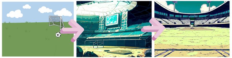
Fig 8. Stadium

Fig 9. Market

Fig 11. Mini Basketball Game in Living Room

Fig 10. Hospital

Fig 12. Bedroom
Characters

Fig 13. Girl 1

Fig 16. Boy 2

Fig 14. Girl 2

Fig 17. Boy 3

Fig 15. Boy 1

Fig 18. Doctor
ii) "Home" Storyline
An update we have with the “Home” storyline is we made it a mini-basketball game. When we played the game ourselves, we noticed that most of the storylines are text and quizzes based. Even though the storylines are very informative, we doubted if 8-13 years old children will be able to absorb all the information provided about type 2 diabetes. Furthermore, the other sections of the game mainly focus on healthy diets and only 1-2 scenes that are related to exercising. Thus, we decided to make this section a mini-game such that children can play and leave an impression that exercise can help lower and control the blood sugar level. The scenes below show what the storyline is like. We first introduced regular exercising that can lower blood glucose and help them to maintain good health. Then, insulin will give examples of what exercise they can do easily and how long the children should exercise every day. Next, they will click on the basketball to start the mini-game which lasts for 3 minutes. After they finish, they will get a badge as a reward.

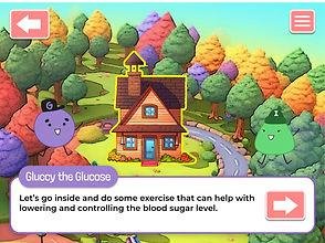


Fig 19. Scenes for “Home” Storyline
iii) User Testing
Since one of our goals is to do user testing, we first did some research and drafted a user interview protocol.
-
Pre-task questions
-
some demographic questions that include school, year, major, and how much knowledge they know about type 2 diabetes
-
-
Task question
-
ask users to use our prototype and test mainly on the Landing/Home page (We use the Figma prototype here as the game still has a lot to debug)
-
-
Post-task questions
-
ask users their overall experience in interacting with the prototype.
-
Due to several concerns including bugs in the game and scheduling issues, we decided not to interview children this quarter. We randomly found 10 interviewees in total, aged 18-24, at UC San Diego’s Price Center and Design Lab. All interviewees have basic knowledge about type 2 diabetes, while 2 out of the ten have in-depth knowledge as they are pre-med students. Other interviewees’ majors include Cognitive Science, Electrical engineering, Business, and Chemical engineering. We summarized and coded the interview results into some key issues and takeaways.
-
10 out of 10 like the visuals very much
-
the flow of the storyline is good and easy to follow.
-
-
6 interviewees suggested that kids might have difficulty understanding the diabetic terms
-
4 interviewees think the roles of the cartoon characters are unclear.
-
One of the interviewees: “I thought glucose is a grape at first as it is round, has a letter G on its hat, and is purple.”
-
-
5 interviewees think it might be hard for 8-13 years old children to follow graphics and dialogue at the same time.
Based on the issues and takeaways, we came up with some solutions that might improve the game. One solution for it is to use “day-to-day” language when explaining the terminologies. Since the roles of the characters are unclear, adding scenes that clearly introduce the characters (glucose and insulin) and what they are can help the children to understand the importance of these two main characters. Lastly, since children have short attention spans, shortening the text to get straight to the point can help to keep them interested in playing the game and learning information about type 2 diabetes.
Inventory
Game release web page:
Final Presentation Slides: